A Window-Seat Film Night, Arranged by Colour
Plan a colour-themed film night with a focused scene set, simple viewing notes, and a clear way to compare how one palette shifts across compositions.
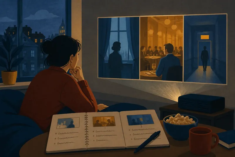
How do you plan a colour-themed film night without turning it into a marathon or a hunt for matching movie posters? Choose a small set of scenes, give each viewing a different compositional question, and watch how one palette changes with its surroundings. A window seat makes a fitting place to settle in: it offers a view, a frame, and a natural reminder that colour never appears alone.
This plan takes a week of light preparation and one evening of viewing. It works with films you already know, library discs, or scenes available through services you use. The central idea is to follow a palette, not a plot or a director. A red coat, a blue room, or a field of green can look prominent in one composition and nearly disappear in another.
Choose a palette that gives you something to compare
Pick a color family with enough variety to change its role across scenes. Red might appear as a small accent against gray, fill most of a room, or sit beside another strong color. Blue can feel open beside pale walls and compressed when enclosed by dark surfaces. Green may blend into a landscape or stand apart from a warm interior.
Rather than choosing a single exact shade, define a loose palette in a sentence: “muted reds against neutral surroundings,” or “cool blues with occasional warm accents.” This lets your set include different films while keeping the comparison focused. It also prevents the evening from becoming a search for identical hues.
Keep a short list of candidate films or scenes. A scene should be long enough for the arrangement of bodies, objects, and background to register, but short enough to revisit without losing the rhythm of the evening. If you are unsure where a color appears, skim a few moments with the sound low; do not rely on a poster, which may use colors absent from the film itself.
Use the week to build a compact scene set
On the first day, write down the palette and the question you want it to raise. For example: “When does blue become the main subject rather than background?” A precise question gives the viewing a direction, but leave room for an answer you did not expect.
On the next day, choose three or four scenes from different films, or from different parts of one film if the visual approaches vary. Aim for contrast in composition rather than merely different stories. One scene might place the color in a costume, another in the setting, and another across several objects. Avoid choosing only scenes where the color is large and vivid; a quiet accent can be more revealing.
By the middle of the week, confirm that each candidate is easy to access and that you can identify a sensible stopping point. Note the film title, scene location, and a brief cue such as “blue curtain behind two people.” A timestamp can help if you have one, but a recognizable action or setting is enough. Do not spend the preparation week searching endlessly for a perfect match. A small, varied set is more useful than a long list.
On the day before the viewing, put out paper and a pen, or open a plain notes app. Make a row for each scene and reserve space for three observations: where the palette appears, what shares the composition with it, and what your eye notices first. Keep the notes deliberately short. You are recording visual decisions, not writing plot summaries.
Arrange the evening around changes in composition
Start with the scene that makes the palette easiest to see. Watch it once without pausing. Note the first place your eye goes, then write down whether the color occupies a person, an object, a surface, or much of the image. This first impression gives you a reference point for the less obvious scenes.
For the next scene, look for the same family of color in a different compositional role. Does it sit near the edge of the image, repeat in several places, or form a large area behind the subject? Notice what lies beside it. A red object against a pale wall may draw attention through contrast; a similar red among warm colors may merge into the room.
Take a brief pause between scenes. Stand, stretch, or look out the window rather than immediately replaying the previous image. The pause is not a ritual that needs to be timed. It simply helps reset your attention so the next composition can make its own impression.
Watch the final scene with a question about change. Does the palette become more prominent as the composition shifts, or does it recede when other elements gather around it? If the scene changes from a wide view to a closer one, compare what the color does in each arrangement. Do not assume that a close view makes a color more important; placement and neighboring shapes still matter.
Record relationships rather than naming colors
A color label alone—“blue,” “red,” “green”—does little to explain why a shot feels organized as it does. Add a relationship: “blue occupies the open wall behind the figure,” or “red repeats in the foreground and the distant doorway.” These notes connect color to composition, which is the purpose of the evening.
Use a simple page layout with one box per scene. In each box, sketch a rough rectangle for the screen and mark only the largest color areas and the main subject. The drawing need not resemble the film. A few blocks and arrows can show whether the palette gathers around a person, divides the image, or leads the eye across it.
Then add a sentence about attention. “I noticed the yellow bag before the face” is more useful than “the scene looked yellow.” It records a viewing response that you can compare with the composition. If you watched with someone else, let them make their own first note before discussing yours; different points of attention can reveal that the same palette supports more than one reading.
Say you choose three invented scenes for a blue-and-amber palette: a person beside a blue window, a crowded amber-lit dining room with a blue jacket, and a blue corridor interrupted by a small amber sign. In your notes, you might expect the window to make blue feel broad and quiet, the jacket to act as a small counterpoint, and the sign to pull attention through the corridor. The useful observation is not whether those expectations are correct. It is whether the surrounding shapes and placements support or complicate them as you watch.
What should you do if a scene has several strong colors?
Keep your chosen palette as the focus, but note the other color that competes with it. Ask whether that color interrupts, balances, or blends with the palette. A scene with several strong hues can still belong if one color has a clear compositional relationship to the others.
How many scenes belong in one viewing?
Choose a compact set that leaves time to watch each scene attentively and write a few notes afterward. If the evening starts to feel like a queue of clips, remove a scene rather than rushing through the comparisons. The aim is a clear sequence of observations, not coverage of every film on your list.
Should you compare scenes from one film or several?
Either choice can work, but they answer different questions. Several films make it easier to compare distinct visual arrangements, while one film lets you notice how its palette changes across settings or moments. Choose the option that best fits the question you wrote during preparation.
What if the color looks different on your screen?
Make notes about broad relationships you can see, such as a color against a dark background or repeated across several objects, rather than trying to identify an exact shade. Display settings, room light, and the source version can affect appearance. If exact color is central to your purpose, follow the device and film-provider guidance for the version you are watching.
Finish with one comparison you can carry forward
Before putting the notes away, place the scene pages side by side. Look for one change in the palette’s role: perhaps it moves from background to accent, becomes fragmented across the image, or gathers around a person. Write one sentence that names the change and the compositional feature that helped you see it.
For a later window-seat film night, keep the notes and choose a new palette or a new question. You might follow the same blue through open spaces, enclosed rooms, and costumes, or ask whether repeated warm colors connect separate areas of a frame. The value of a colour-themed film night is not a final verdict about what a color means. It is a habit of noticing where the image places it, what it meets, and how that arrangement guides your attention.